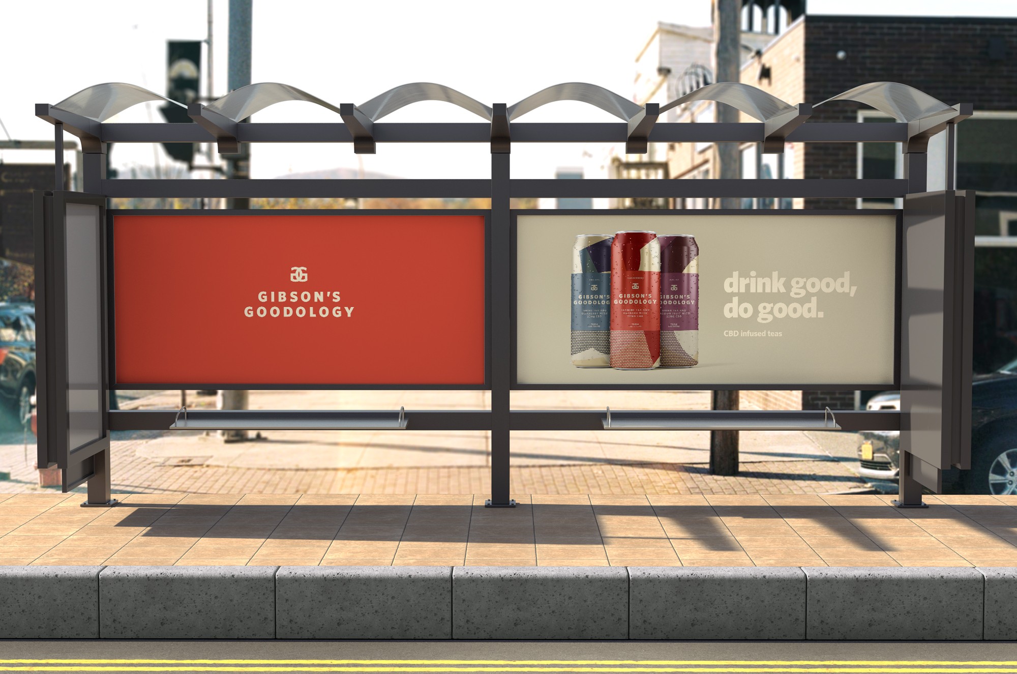
Gibson’s Goodology, a UK-based beverage company, is pioneering the emerging European cannabis market. In contrast to its competitors, Gibson’s stands out by offering the highest CBD content per can on the market and award-winning flavours.
The objective was to develop a visually appealing and artistic brand that captures the effervescent essence of the beverage.
A brand identity was crafted that exudes a contemporary and sophisticated aesthetic, featuring a clean sans-serif typeface with a playful twist, complemented by a prominent monogram. Colours derived from each of the distinctive flavours were incorporated, along with art-deco-inspired shapes and patterns, to create visually striking cans that would resonate on store shelves.